 Sitting staring at a blank Word document can be a killer. That’s a lot of white space to fill. If you want to feel better about that, you have two options:
1. turn up the font size to 50, OR
2. make the white space smaller.
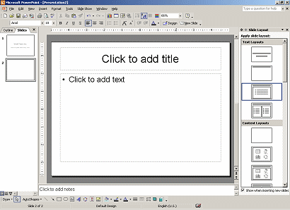
 Allow me to introduce: the Powerpoint slide.
If you’re considering creating a course alongside your book, or even a talk, then it can sometimes help to start with the slide deck rather than the book itself. Don’t worry about layouts or formatting or finding pretty pictures, we’re just talking about a title with a handful of bulletpoints below for now.
If you already have a table of contents, that will be your starting point for the structure. And then it’s just a question of working out roughly how many key points there are per chapter/section (ie how many titles, and therefore how many slides) and getting down the bullet points.
It’s a bit like using virtual post-it notes: you can move the slides around easily if you need to (and they take up much less wall space). One of my clients is using this technique very successfully at the moment, creating slides to outline a course which will be a revenue-generating activity (financial motivation, good) and which he’s promised to deliver for a client (accountability, even better). It’s also meant that his co-tutor is looking over the material as he works, which is reassuring him that his scope, structure and quality of thinking are all bang on target.
Guy Kawasaki has some great advice on preparing a presentation which he calls the 10/20/30 rule: no more than 10 slides, lasting no longer than 20 minutes, and no text below 30 point font size. He’s talking about pitches, but the principle is sound. There’s a limit to how many ideas we can take on board at a single sitting. It’s not a bad rule of thumb to set yourself a limit of 10 slides, each with around 5 or 6 explanatory bullet points, as the maximum for any one chapter. And I wouldn’t mind at all if it were a good deal lower than that.
What you do with your finished slide deck is up to you – you can prettify it and work it up into a full course, you can pick out one section or a few headlines and create a talk or presentation, or simply use it as a prompt sheet to help you write the book. When I worked in academic publishing, a slide deck covering the main points of each chapter was often provided as part of the online resources in the companion website for student textbooks, a tool to help lecturers convey the concepts to their class.
How could you use a slide deck of your book’s content: for training, as an additional resource for readers who need to present the concepts to others, as a talk you could give at networkign events or conferences, perhaps? I’d love to hear any other ideas you might have – post your comments below!
